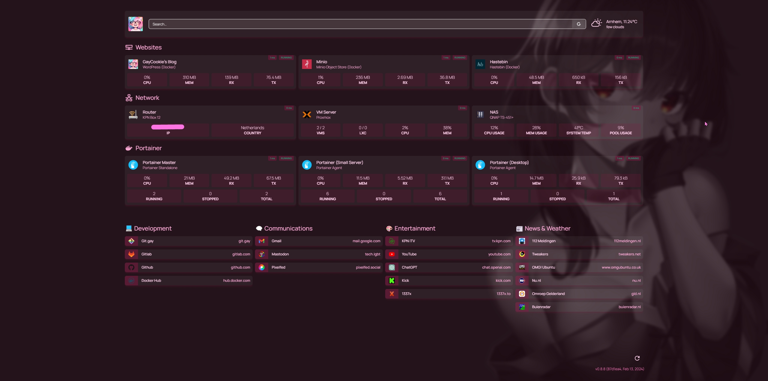
I’m not a fan of dashboards. Often, I find them cluttered, unnecessary, and confusing.
But Homepage is different. After a day or two of tinkering, I’ve fallen in love with it.
What is Homepage?
Homepage is an open-source, self-hosted informational dashboard, and bookmarks organizer.
It essentially serves as a personalized starting point for your web browsing activities
What makes Homepage so special?
It is a powerful tool that helps you organize and optimize your online life and/or home lab.
It’s a place where you can find everything you need without the need for searching.
- Simple & Intuitive: The interface is clean and user-friendly. Unlike other dashboards, Homepage doesn’t feel overwhelming.
- Customizable: You can configure Homepage according to your preferences. Adding widgets, adjusting the layout, changing colors – everything is possible.
- Focus on Functionality: Homepage is not a collection of useless gadgets. The features are carefully selected and genuinely useful.
- Super Fast: Homepage is incredibly fast. No delays or glitches, just a smooth user experience.
Installation and Usage
Like many other dashboards, Homepage has a Docker image available, making it effortlessly usable.
Since Homepage doesn’t require a database and operates entirely through YAML files, you only need one container.
Setting this up is made easy with their Docker Compose examples in the documentation.
Once installed, using Homepage is straightforward.
All you need to do is adjust YAML files, which is made easy with the help of the documentation.
After modifying one of the config files, the Homepage page even reloads itself. 😎
Updates and Support
At the time of this review, Homepage is a healthy two-year-old project that regularly receives updates.
The active community on Github, Discord, and the extensive documentation provide valuable support for Homepage users.
Areas for Improvement
- Built-in column system for bookmarks
The current implementation of columns, in my opinion, is not perfect.
On my screen resolution, the default number of columns is six, which is too much and leaves little space for names and URLs.
It would be a good improvement if users could specify how many columns per row. - Favicon support
While users can set icons with favicons per bookmark manually, it would be cooler if it happened automatically.
With tools like favicongrabber.com, google.com/s2/favicons, or icons.duckduckgo.com/ip3, there must be a way to implement this.
Conclusion
Homepage is a powerful and flexible tool that enables a personalized and efficient web experience.
Its versatility, user-friendliness, and customizability make it an attractive option for users looking to optimize their online workflow.
| Pros | Cons |
|---|---|
| Extensive personalization | Limitations in bookmarks |
| Seamless integration | Lack of favicons |
| API flexibility | |
| Open Source |


